Components Schema
The schema is an important concept within sfb-theme-components. It determines whether components are customizable through the Theme Editor.
For example, you can define branding properties like height or background-colour in a component that Marketplace Managers can later customize with the Theme Editor. Therefore, you enable users to enrich existing theme components without the need for coding expertise.
The following table lists the properties that you can specify for your component's schema so your Marketplace Manager can customize your components with the Theme Editor.
| Property name | Description | Type |
|---|---|---|
| name | The name of the component. This name must be unique and identifies the component to use in the theme. | String |
| title | The title of the component to display in the Theme Editor. | String |
| iconName | The icon that will be displayed in the Theme Editor for this component. | String |
| orderableSection | The sections or storefront pages to which users can add this component with the Theme Editor. | Array of constants/namespaces.js enum |
| menus | The different menu(s) created in the Theme Editor that the component can consume. | Array of constants/menus.js enum |
| hasChildrenComponents | This property indicates if a component has children components or not. | Boolean |
| form | The branding properties that a user can customize in the Theme Editor for this component. Each branding property can be associated with a . | Object |
How do components consume the schema form?
Let's create a custom Banner component as an example. This Banner component displays some promotional text.
import React from 'react';
import PropTypes from 'prop-types';
import { COLORPICKER, INPUT, SLIDER } from '@appdirect/sfb-theme-components/src/constants/schemaComponentTypes';
import withListener from '@appdirect/sfb-theme-components/src/components/withListener';
import './styles/Banner.scss';

const Banner = props => {
    const { settings = {} } = props;
    const {
        title,
        backgroundColor,
        textColor,
        height,
    } = settings;

    const bannerStyle = {
        backgroundColor,
        color: textColor,
        height: `${height}px`
    };

    return (
        <div style={bannerStyle}>
            {title}
        </div>
    );
};

Banner.schema = () => ({
    name: 'Banner',
    title: 'Banner',
    iconName: 'carousel',
    form: {
        title: {
            title: 'Banner title',
            placeholder: 'Banner title',
            defaultValue: 'My awesome banner title',
            type: INPUT,
            required: true,
            validation: {
                pattern: /^[a-zA-Z0-9 ]+$/gm,
                message: 'Invalid text'
            }
        },
        backgroundColor: {
            title: 'Banner background color',
            defaultValue: '#0076ce',
            type: COLORPICKER
        },
        textColor: {
            title: 'Banner text color',
            defaultValue: '#ffffff',
            type: COLORPICKER
        },
        height: {
            title: 'Banner height',
            type: SLIDER,
            required: true,
            defaultValue: 35,
            options: {
                step: 1,
                min: 0,
                max: 100
            }
      }
    }
});

const SETTINGS = Banner.schema().form;
export default withListener(Banner);
As you can see, in this component the schema specifies Banner as the name, Banner as the title, and carousel as the iconName. The Marketplace Manager can customize these branding properties in the Theme Editor:
- Title
- Background colour
- Text colour
- Height
A Marketplace Manager can now customize this Banner component in the Theme Editor and save the form settings into the database. Every component has a settings prop that receives the form setting changes made by the Marketplace Manager in the Theme Editor, so the component can receive and render the form setting customizations. Note that this is done by server-side component rendering: the corresponding settings for each component are automatically injected.
This is how the settings props in the component are retrieved and the customizations are applied:
const { settings = {} } = props;
const {
    title,
    backgroundColor,
    textColor,
    height,
} = settings;
withListener HOC
Note that the Banner code snippet above uses the withListener HOC. This HOC enables you to make the component send a custom event in the Theme Editor preview panel on each form setting change. Therefore, you would be able to see your form setting changes live in the Theme Editor preview panel.
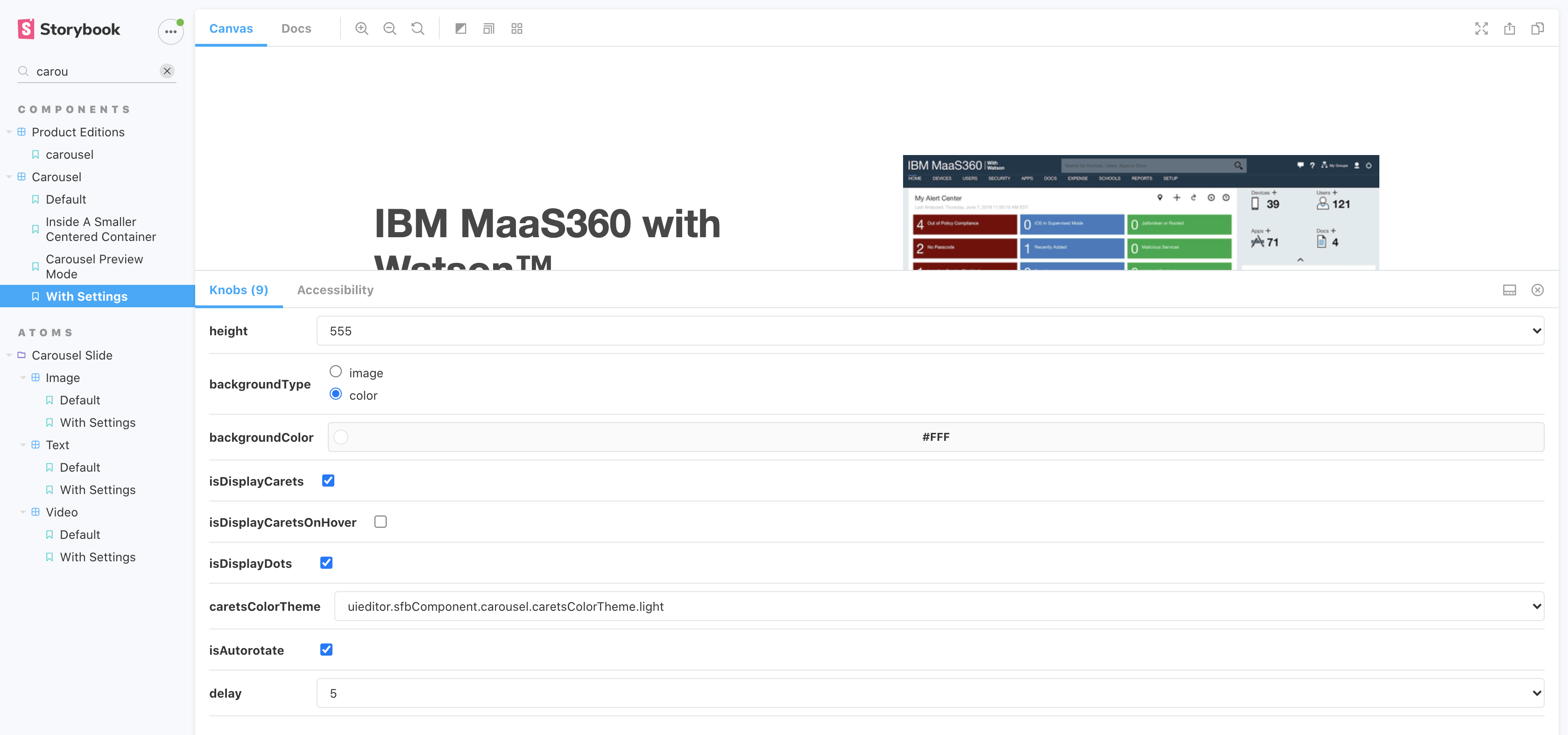
Storybook knobs
After you add a schema form that contains branding properties associated with a schema component type, you can test the prop settings through Storybook knobs.
The Storybook knobs feature enables you to edit props dynamically using the Storybook UI so that you can preview your schema form setting changes.
Each schema component type is mapped to an appropriate knob. You can edit the value in Storybook UI with knobs for each schema component type.
| Schema Component Type | Knobs |
|---|---|
| INPUT | text |
| TEXTAREA | text |
| DROPDOWN | select |
| TOGGLE | boolean |
| TOGGLE_CHECK | boolean |
| COLORPICKER | color |
| RADIO | select |
| CHECKBOX | optionsKnob |
| IMAGE_UPLOADER | object |
| SLIDER | number |
Screenshot
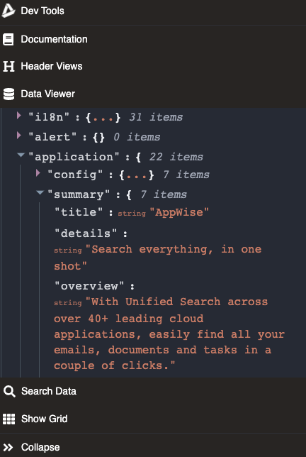
Marketplace data
If you want to retrieve specific field data from the page object (available in the data viewer in the toolkit's toolbar), you can specify that in the schema object through the marketplaceData object.
Example
The TabsMenu component needs to get the following data from the page object:
In the schema object with the marketplaceData object, you need to map each attribute to a page object's field:
marketplaceData: {
    summary: 'application.summary',
    callToActions: 'application.callToActions',
    items: 'application.navigation.items'

}
Then you can use the marketplaceData properties in your component through the data props:
TabsMenuComponent.propTypes = {
    data: PropTypes.shape({
        items: PropTypes.arrayOf(
            PropTypes.shape({
                label: PropTypes.string,
                href: PropTypes.string,
                value: PropTypes.string,
                selected: PropTypes.bool
            })
        ),
        summary: PropTypes.shape({
            logoSrc: PropTypes.string,
            title: PropTypes.string
        }),
        callToActions: PropTypes.shape({
            items: PropTypes.arrayOf(
                PropTypes.shape({
                    label: PropTypes.string,
                    tooltip: PropTypes.string,
                    isPrimary: PropTypes.bool,
                    disabled: PropTypes.bool,
                    url: PropTypes.string,
                    actionType: PropTypes.string
                })
            )
        })
    })
}
Was this page helpful?
Tell us more…
Help us improve our content. Responses are anonymous.
Thanks
We appreciate your feedback!