Schema Component Types
- INPUT
- TEXTAREA
- DROPDOWN
- TOGGLE
- TOGGLE_CHECK
- COLORPICKER
- RADIO
- CHECKBOX
- SLIDER
- GROUP_HEADER
- SPACER
- SLIDES
- PRODUCTS_LIST
- IMAGE_UPLOADER
- TABS_LIST
- DRAWER_LIST
- LOGO
- Conditional rendering of schema form settings
INPUT
Description
INPUT types display an input field.
Screenshot

Properties
| Property name | Description |
|---|---|
| title | The label text for the input field. |
| placeholder | The placeholder text for the input field. |
| defaultValue | The default value text for the input field. |
| type | The schema component type: INPUT. |
| required | Specify whether the input field value is required. true or false. |
| validation.pattern | The regex expression to validate the input field value. |
| validation.message | The error validation message text. |
Form Schema Example
sliderTitle: {
    title: 'Slider Title',
    placeholder: 'Slider title',
    defaultValue: 'Slider title',
    type: INPUT,
    required: true,
    validation: {
        pattern: /^[a-zA-Z0-9 ]+$/gm,
        message: 'This field is invalid'
    }
},
TEXTAREA
Description
TEXTAREA types display a multi-line plain-text editing control.
Screenshot

Properties
| Property name | Description |
|---|---|
| title | The label text for the multi-line plain-text field. |
| placeholder | The placeholder text for multi-line plain-text field. |
| defaultValue | The default value text for multi-line plain-text field. |
| type | The schema component type: TEXTAREA. |
| required | Specify whether the multi-line plain-text field value is required. true or false. |
| validation.pattern | The regex expression to validate the multi-line plain-text field value. |
| validation.message | The error validation message text. |
Form Schema Example
description: {
    title: 'Description',
    placeholder: 'Description',
    defaultValue: 'Description',
    type: TEXTAREA,
    required: true,
    validation: {
        pattern: /^[a-zA-Z0-9 ]+$/gm,
        message: 'This field is invalid'
    }
}
DROPDOWN
Description
DROPDOWN types display a control that provides a menu of options through a dropdown list. One option can be selected.
Screenshot

Properties
| Property name | Description |
|---|---|
| title | The label text for the dropdown list field. |
| defaultValue | The default option value for the dropdown list field. |
| type | The schema component type: DROPDOWN. |
| required | Specify whether the dropdown list field value is required. true or false. |
| options | The menu of options for the dropdown list. |
| validation.default | The default option text to display when no options were selected |
Form Schema Example
const HEIGHT_OPTIONS = [
    { value: 400, label: 'Small 400px' },
    { value: 555, label: 'Medium 555px' },
    { value: 660, label: 'Large 660px' }
];

height: {
    title: 'Height',
    type: DROPDOWN,
    required: false,
    defaultValue: HEIGHT_OPTIONS[1].value,
    options: HEIGHT_OPTIONS,
    validation: {
        default: 'Select'
    }
}
TOGGLE
Description
TOGGLE types display a control that provides a switch between two different options.
Screenshot
Properties
| Property name | Description |
|---|---|
| labelOn | The label text to display when the switch is on. |
| labelOdd | The label text to display when the switch is off. |
| defaultValue | The default switch option. true or false. |
| type | The schema component type: TOGGLE. |
Form Schema Example
showRatings: {
    labelOn: 'uieditor.sfbComponent.productBanner.showRatings.labelOn',
    labelOff: 'uieditor.sfbComponent.productBanner.showRatings.labelOff',
    defaultValue: true,
    type: TOGGLE
}
TOGGLE_CHECK
Description
TOGGLE_CHECK types display a control that provides a checkbox to switch between two different options.
Screenshot
Properties
| Property name | Description |
|---|---|
| label | The label text for the checkbox field. |
| defaultValue | The default option value for the checkbox field. true or false. |
| type | The schema component type: TOGGLE_CHECK. |
| marginSize | The margin between the checkbox field in pixel (px). |
| indentSize | The left padding for the checkbox field. The value is multiplied by 25 pixels (px). |
Form Schema Example
isDisplayCarets: {
    label: 'Display carets',
    defaultValue: true,
    type: TOGGLE_CHECK,
    marginSize: 10,
    indentSize: 0
},
COLORPICKER
Description
COLORPICKER types display a control that provides a color palette to select a specific color.
Screenshot
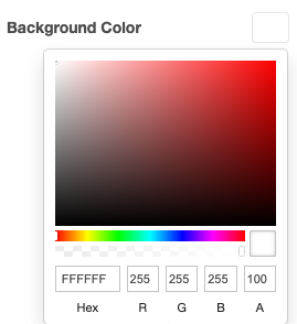
Properties
| Property name | Description |
|---|---|
| title | The label text for the color picker field. |
| defaultValue | The default color value in hex code for the color picker field. |
| type | The schema component type: COLORPICKER. |
Form Schema Example
backgroundColor: {
    title: 'Backround color',
    defaultValue: '#474747',
    type: COLORPICKER
},
RADIO
Description
RADIO types display a control that provides a menu of options (also known as radio buttons). One option can be selected.
Screenshot

Properties
| Property name | Description |
|---|---|
| title | The label text for the radio button group field. |
| required | Specify whether the radio button group field value is required. true or false. |
| defaultValue | The default value the radio button group field. |
| type | The schema component type: RADIO. |
Form Schema Example
const SLIDE_SIZES = [
    { value: 'xsmall', label: 'X-Small' },
    { value: 'small', label: 'Small' },
    { value: 'medium', label: 'Medium' },
    { value: 'large', label: 'Large' },
];

size: {
    title: 'Size',
    required: true,
    defaultValue: SLIDE_SIZES[0].value,
    options: SLIDE_SIZES,
    type: RADIO
}
CHECKBOX
Description
CHECKBOX types display a control that provides a menu of options through checkboxes group. Multiple options can be selected.
Screenshot

Properties
| Property name | Description |
|---|---|
| required | Specify whether the checkbox group field value is required. true or false. |
| defaultValue | The default value the checkbox group field. |
| options | The menu of options for the checkbox group field. |
| type | The schema component type: CHECKBOX. |
| marginSize | The margin between the checkbox group field in pixel (px). |
| indentSize | The left padding for the checkbox group field. The value is multiplied by 25 pixels (px). |
Form Schema Example
SLIDER
Description
SLIDER types display a control that provides a slider to specify a numeric value between a specified minimum and maximum value.
Screenshot

Properties
| Property name | Description |
|---|---|
| title | The label text for the slider field. |
| defaultValue | The default value of the slider field. |
| type | The schema component type: CHECKBOX. |
| options.min | The minimum numeric value |
| options.max | The maximum numeric value |
| options.step | The step numeric value |
Form Schema Example
borderRadius: {
    title: 'uieditor.sfbComponent.sliderComponent.borderRadius.title',
    type: SLIDER,
    defaultValue: 8,
    options: {
        min: 0,
        max: 35,
        step: 1
    }
}
GROUP_HEADER
Description
GROUP_HEADER types display a group header text.
Screenshot

Properties
| Property name | Description |
|---|---|
| title | The label text for the group header. |
| type | The schema component type: GROUP_HEADER. |
Form Schema Example
sliderSettings: {
    title: 'Settings',
    type: GROUP_HEADER
},
SPACER
Description
SPACER types display a vertical space of 24px.
Screenshot
N/A
Properties
| Property name | Description |
|---|---|
| type | The schema component type: SPACER. |
Form Schema Example
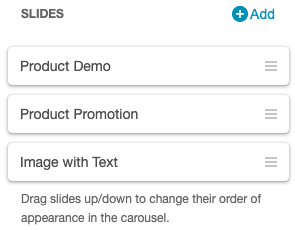
SLIDES
Description
SLIDES types display a control that manages slides for the Carousel component.
Screenshot
Properties
| Property name | Description |
|---|---|
| required | Specify whether the checkbox group field value is required. true or false. |
| defaultValue | The default value the checkbox group field. |
| options | The menu of options for the checkbox group field. |
| type | The schema component type: CHECKBOX. |
| marginSize | The margin between the checkbox group field in pixels (px). |
| indentSize | The left padding for the checkbox group field. The value is multiplied by 25 pixels (px). |
Form Schema Example
PRODUCTS_LIST
Description
PRODUCTS_LIST types display a control that manages the product list of the Slider component for product curation.
Screenshot

Properties
| Property name | Description |
|---|---|
| title | The product list title. |
| defaultValue.items | The array of product list. |
| defaultValue.contentType | The product list curated type. manual or dynamic. |
| type | The schema component type: PRODUCT_LIST. |
| required | Specify whether the product list is required. true or false. |
Form Schema Example
productsList: {
    title: 'Products',
    defaultValue: {
        items: [],
        contentType: DYNAMICALLY_CURATED_CONTENT_TYPE
    },
    type: PRODUCTS_LIST,
    required: true
}
IMAGE_UPLOADER
Description
IMAGE_UPLOADER types displays a control that allows image uploading.
Screenshot

Properties
| Property name | Description |
|---|---|
| title | The label text for the image upload field. |
| caption | The caption text to display below the image upload field. |
| placeholder | The placeholder text to display inside the image upload field. |
| defaultValue | The default value of the image upload field. An object with filename, type, url. |
| type | The schema component type: IMAGE_UPLOADER. |
| required | Specify whether the image upload field is required. true or false. |
Form Schema Example
backgroundImg: {
    title: 'Background Image',
    caption: 'Supports JPG and PNG formats up to 2MB.',
    placeholder: 'Choose File',
    defaultValue: {},
    type: IMAGE_UPLOADER,
    required: false,
}
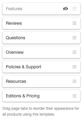
TABS_LIST
Description
TABS_LIST types display a control that manages the tab list of the ProductTabMenu component.
Screenshot
Properties
| Property name | Description |
|---|---|
| type | The schema component type: TABS_LIST. |
| defaultValue | Specify an array of tab items. |
Form Schema Example
const PROFILE_TABS = {
    overview: {
        label: '',
        defaultLabel: 'uieditor.tabs.overview',
        href: '/en-US/apps/163915/talech/overview',
        value: 'overview',
        selected: true,
        isEditMode: false,
        isVisible: true
    },
    features: {
        label: '',
        defaultLabel: 'uieditor.tabs.features',
        href: '/en-US/apps/163915/talech/features',
        value: 'features',
        selected: false,
        isEditMode: false,
        isVisible: true
    },
    reviews: {
        label: '',
        defaultLabel: 'uieditor.tabs.review',
        href: '/en-US/apps/163915/talech/reviews',
        value: 'reviews',
        selected: false,
        isEditMode: false,
        isVisible: true
    }
};

pageTabs: {
    type: TABS_LIST,
    defaultValue: [
        PROFILE_TABS.overview, PROFILE_TABS.features, PROFILE_TABS.reviews
    ]
}
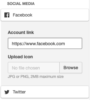
DRAWER_LIST
Description
DRAWER_LIST types display a control that manages a expandable list with custom forms.
Screenshot
Properties
| Property name | Description |
|---|---|
| type | The schema component type: DRAWER_LIST. |
| defaultValue | Specify an array of drawer items, the expandable form object and allowed context menu options. |
Form Schema Example
const DRAWER_LIST_ITEMS = {
    items: [
        {
            label: 'Facebook',
            icon: 'facebook',
            values: {
                accountLink: {
                    value: 'https://www.facebook.com'
                }
            }
        },
        {
            label: 'Twitter',
            icon: 'twitter',
            values: {
                accountLink: {
                    value: 'https://www.twitter.com'
                }
            }
        }
    ],
    form: {
        accountLink: {
            title: 'account link',
            placeholder: 'placeholder',
            defaultValue: '',
            type: INPUT,
            required: false,
            validation: {
                pattern: /^(http:\/\/www\.|https:\/\/www\.|http:\/\/|https:\/\/)?[a-z0-9]+([-.]{1}[a-z0-9]+)*\.[a-z]{2,5}(:[0-9]{1,5})?(\/.*)?$/g,
                message: 'Invalid field'
            }
        },
        uploadIcon: {
            title: 'upload icon',
            caption: 'caption',
            placeholder: 'placeholder',
            buttonText: 'buttonText',
            defaultValue: '',
            type: IMAGE_UPLOADER,
            required: false
        }
    },
    contextMenuOptions: ['SHOW_HIDE']
};

drawerList: {
    type: DRAWER_LIST,
    defaultValue: DRAWER_LIST_ITEMS
}
Description
LOGO types display a control that manages which logo (light, dark, no logo) is displayed. Logo image urls are saved in the css properties as --logoImage (lightLogo) and --darkLogo.
Screenshot

Properties
| Property name | Description |
|---|---|
| type | The schema component type: LOGO. |
| defaultValue | Specify the default selected logo type ('lightLogo', 'darkLogo', 'noLogo'). |
Form Schema Example
footerLogo: {
    type: LOGO,
    defaultValue: 'darkLogo'
}
Conditional rendering of schema form settings
If you want to disable/hide one schema form setting based on the value of another schema form setting, you can use the conditionalAttributes property.
Properties
Right now, the conditional type is isDisabled or isVisible:
| Conditional types | Description |
|---|---|
| conditionalAttributes.isDisabled | Disable this schema form setting based on the child condition. |
| conditionalAttributes.isVisible | Make this schema form setting visible based on the child condition. |
The child condition:
| Condition properties | Description |
|---|---|
| when | The name of the schema form setting that the condition depends on |
| connector | The connector condition can have one of these values: equals, notEquals, include or notInclude |
| value | The value to apply |
Form Schema Example
isDisplayCarets: {
    label: 'Display Carets',
    defaultValue: true,
    type: TOGGLE_CHECK,
    marginSize: 10
},
isDisplayCaretsOnHover: {
    label: 'Display Carets On Hover',
    defaultValue: false,
    type: TOGGLE_CHECK,
    conditionalAttributes: {
        isVisible: {
            when: 'isDisplayCarets',
            connector: 'equals',
            value: true
        }
    },
    indentSize: 1,
    marginSize: 10
}
Was this page helpful?
Tell us more…
Help us improve our content. Responses are anonymous.
Thanks
We appreciate your feedback!