Storefront Plaza Theme
The Plaza theme provides a generic e-commerce storefront for a marketplace that primarily sells digital subscription services. You can use Plaza as a reference and example when working on your own themes.
The Plaza theme meets the AA accessibility standards defined in version 2.2 of the W3C Web Content Accessibility Guidelines specification.
The Plaza theme is based on the component approach to theme design. Components are re-usable and configurable UI elements, such as sidebars or sliders. provides a library of components with the Storefront Toolkit, and you can also create custom components if you need them (see Enable custom components).
You can work with components in the Storefront Toolkit by adding them to the storefront pages. After a Plaza based theme has been uploaded to the marketplace, the components in it can be fine-tuned by a using the Theme Editor.
The Plaza theme contains the following pages and sections:
- A Home page, which features a product carousel and a slider (horizontal list) of selected products.
- A product Listing page that contains a vertical list of all products.
- A profile page for bundle products.
- A Product profile page, which includes a product banner, image, description, and some supplementary information such as product questions. There are also subsections for edition and pricing information and product features.
- An FAQ page.
- The Checkout page (if your marketplace uses the latest version of the checkout feature).
- A Header & Footer section for modifying the banners that appear across the top and bottom of each storefront page.
Some components are used on multiple pages, while others are only available on a single page. The following sections show each page in the Plaza theme and the components used on each page.
Home page
The Plaza home page contains a carousel at the top of the page as well as a product slider that lists popular products.
| Component name | Description | Customization options |
|---|---|---|
| Carousel | Series of slides that link to any desired page or website. | Slide contents, carets and page dots, carousel height, speed of slide rotation. |
| Slider | List of products to promote to site visitors, based on product groups or a manually curated selection. | Number of rows, tile size and style, quickview appearance. |

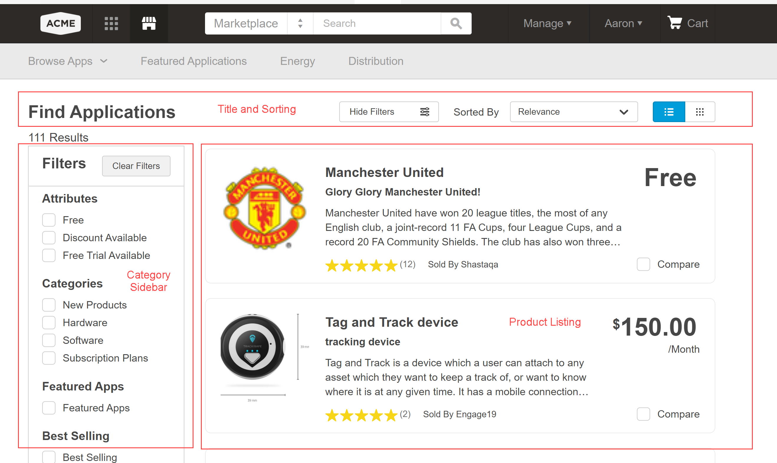
Listing page
The listing page, where you browse, search for, and filter marketplace products, contains three fixed components.
| Component name | Description | Customization options |
|---|---|---|
| Title and Sorting | The page title as well as the list filters and sorting options. | n/a |
| Category Sidebar | Displays the various product categories, attributes, and ratings, which you can select to filter the product list. For more information about product groups, categories, and attributes, see Organize products. | Dividers, borders, backgrounds, size, presence of subcategories. |
| Product Listing | Paged list of marketplace products, which you can narrow with filters or selections in the sidebar. | Icon size, text/background/border colors, presence of comparison option and ratings. |
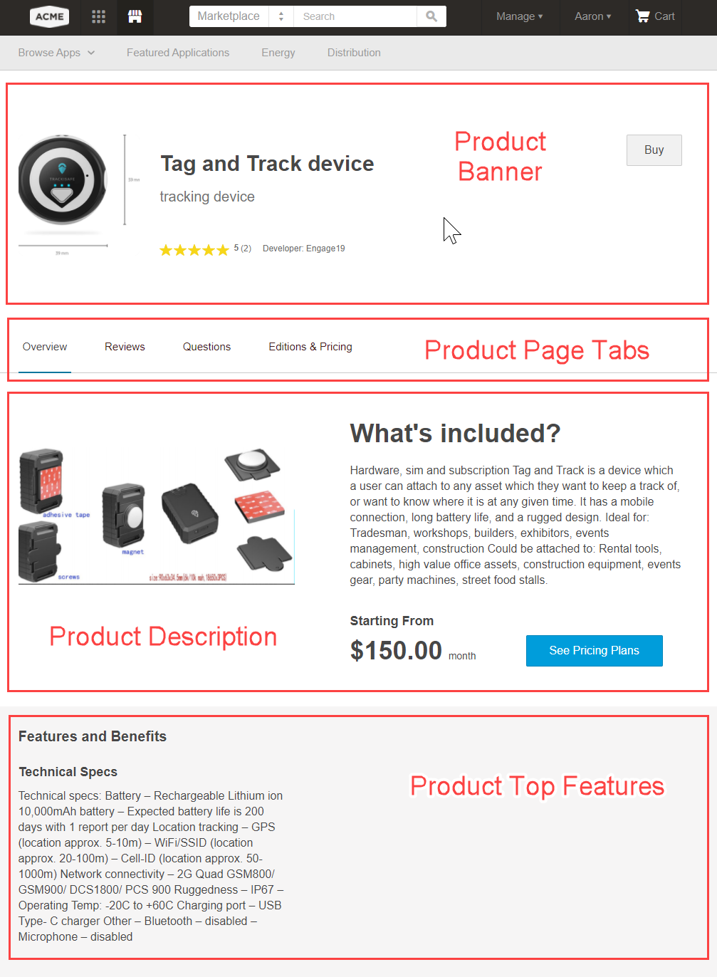
Product profile page
The product profile page contains many components that display different profile information. Most of the contents of the components are determined by product configuration (see the topics in the Edit product profiles and branding section).
| Component name | Description | Customization options |
|---|---|---|
| Product Banner | Top banner that includes the product logo, a short description, and a call to action (Buy, Start a Free Trial, and so on). | Background style and color, product image, text size, banner size, presence or rating stars. |
| Product Page Tabs | Tab links to the different sections of the profile page. | Height, spacing, text and background colors. |
| Product Description | Images, product description, prices and add-ons. | Image style, presence of prices and add-ons. |
| Product Top Features | A list of the product "Benefits" that are configured as part of the profile. | Number of columns, presence of icons. |
| Product Featured Customers | List of featured customer logos. | Color or monochrome for logos, automatic rotation of logos and rotation speed. |
| Product Reviews | List of verbatim reviews and ratings. | Position of average rating, presence of reviewer avatar, "More reviews" button label. |
| Product Additional Info | Product terms and conditions, support information, and categories | Number of columns, position of information, background and border colors. |
| Product Questions | Product questions and answers, as well as a button that users can click to ask questions. | n/a |
| Product Resources | List of supplementary resources such as PDFs, Sribd documents, or videos. | Number and spacing of columns. |
| Product Similar Apps | A slider that lists similar products (that is, products sold by the same vendor). Unlike other sliders, you cannot choose the products to include. | Slider title, number of rows, tile size and style, quickview appearance. |


Editions and pricing
The Editions & Pricing page contains a single component that lists the product edition information in a series of tiles. The number and contents of the tiles depend on the edition configuration (see Edit editions and pricing).
| Component name | Description | Customization options |
|---|---|---|
| Product Pricing | A slider that lists all product editions. | n/a |

Feature Details
The Feature Details page contains a single component that contains the detailed product feature descriptions (see Add product features).
| Component name | Description | Customization options |
|---|---|---|
| Product Feature Details | A vertical list of the full product features. | Number of columns, alignment, image position and shadow, background color. |

FAQ
The FAQ page contains a single component that displays any FAQ entries that the configured (see Create FAQs).
| Component name | Description | Customization options |
|---|---|---|
| FAQs | The FAQ question and response text. | Determine whether each question is expandable or all text is displayed by default. Background and menu color, dividers, padding and borders. |

Checkout
The Checkout page in the Theme Editor is only available on marketplaces that use the latest version of the checkout feature. If you want to use the latest checkout version or are not sure which version your marketplace uses, contact .
The Checkout page is separate from the other storefront pages and has its own button, text, and link styles. The options are similar to those described in Change storefront colors but only apply to the Checkout page.
| Component name | Customization options |
|---|---|
| n/a | Change the logo to use on the Checkout page. Choose text and button colors. |
: Checkout page components
Header & Footer
The Header & Footer section of the Plaza theme serves as a container for the storefront header and footer, the banners that appear across the top and bottom of each storefront page.
You can modify the menus that appear in the header and footer. See Work with header and footer menus.
Header

The header can include these components:
| Component name | Description |
|---|---|
| Announcement Bar | An optional bar for highlighting a special message. |
| Auxiliary Bar | An optional bar to supplement the Home bar. |
| Home Bar | The main marketplace navigation bar. This bar can include the logo, the name of the current user, and the cart icon. |
| Navigation Bar | An optional bar for additional links to navigate the marketplace. |
| Search field | The search field for searching the marketplace. |
For each of these components, Marketplace Managers can modify characteristics such as the size, background color, text size and color, alignment, borders, and placement.
Marketplace Managers can upload custom logos to use for the to use for the cart and login icons in the Home bar. They can also upload an icon for the Search field, and specify the bar in which it appears.
Footer

The Footer component offers three basic styles: Classic, Newsletter & Social, or Sitemap. The Classic style displays all footer items in one main section, while the other two styles split them between the main section and an additional bottom bar that can have its own background and text colors.
In addition to the standard formatting options in both sections (colors, text size and placement, and so on), s can use the Footer options to add a copyright notice, and links to social media sites such as Facebook, Twitter, and LinkedIn.
Was this page helpful?
Tell us more…
Help us improve our content. Responses are anonymous.
Thanks
We appreciate your feedback!